
The Early Childhood Policy Research Group (ECPRG) is excited to announce the launch of the Florida Index of Preschool Access (FLIPA)! While similar to the popular, previously developed tool, FLICCA, it aims to help policymakers and implementers understand preschool access for families with children enrolled in the Florida Voluntary Prekindergarten Education Program (VPK).
What should I know about this tool?
- This first release of the FLIPA includes data from the 2023-2024 Fiscal Year.
- The specific enrollment data displayed on this tool is from January 2024, the month with the largest VPK enrollment.
- The index calculation aligns with the method used for the FLICCA, but it is applied at the classroom level.
- It includes four Classroom Assessment Scoring System (CLASS) score thresholds: 4, 4.5, 5, and 6.
- Due to the limited number of home-based VPK providers in Florida and concerns regarding the privacy of residential addresses, home-based providers were excluded from the visualizations and infrastructure calculations. Additionally, only VPK classrooms with reported classroom capacity were included. This resulted in 67 classrooms (321 enrollments) being removed from the FLIPA calculation.
How do I use this tool?
- At the top of the webpage, you will find five charts displaying coalition-specific information regarding VPK participation rates, utilization rates, enrollment by provider type and quality level, and number of classrooms by quality level. You can toggle between coalitions using the “Coalition” drop-down menu in the top-right corner to refresh the charts.
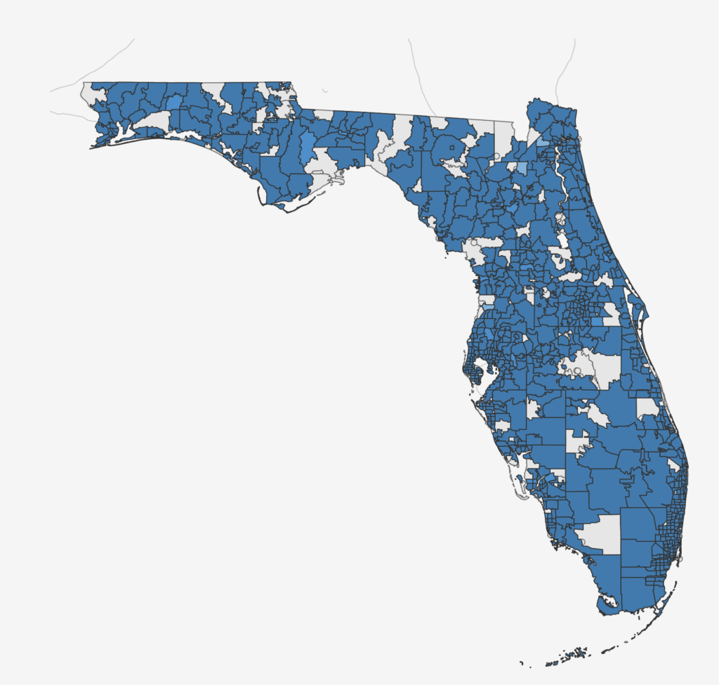
- Once you have selected a coalition, the main window of the webpage will adjust to highlight the geographic area of the chosen coalition. Here, you can adjust the CLASS score threshold drop-down menu to define the CLASS score of “High quality care.” The map displays the index of “Percentage of High Quality (HQ) VPK Enrollment” as a blue color ramp. The lighter the color, the lower the percentage of HQ VPK enrollment, compared to the total VPK enrollment. The infrastructure index is displayed as a label on top of the Percentage of HQ VPK enrollment layer, with negative infrastructure values shown in pink.
- To view detailed information about VPK providers within each coalition, toggle the “Show/Hide Providers” button to reveal the provider page. Circles represent center-based providers, while squares indicate public schools. You can select to show providers by CLASS score or utilization rate. Clicking on any provider will highlight it on the map and display detailed information, including name, zip code, program type, VPK capacity, VPK enrollment, and VPK CLASS scores.
- If you are looking for a specific provider, click the “Find a specific provider in your area” button. Type in part of the provider’s name into the “Search” window and click Enter. The provider will pop up on the map and in the sidebar.
- To review key terms and definitions, click “Key Terms & Definitions” in the top-right corner of the webpage.
Visit our Childcare Access page to explore the new tool!